Sunday, 22 January 2012

Assignment 6 (part) - Visit to Art Galleries in Fowey


Fowey is a little seaside place, best known for its most famous resident Daphne du Maurier. It's a quaint little town, with bookshops full of du Mauriers works, restaurants full of fish dishes, Tea rooms full of cakes, and I would hope, Art Galleries full of Art. 

21/01/12


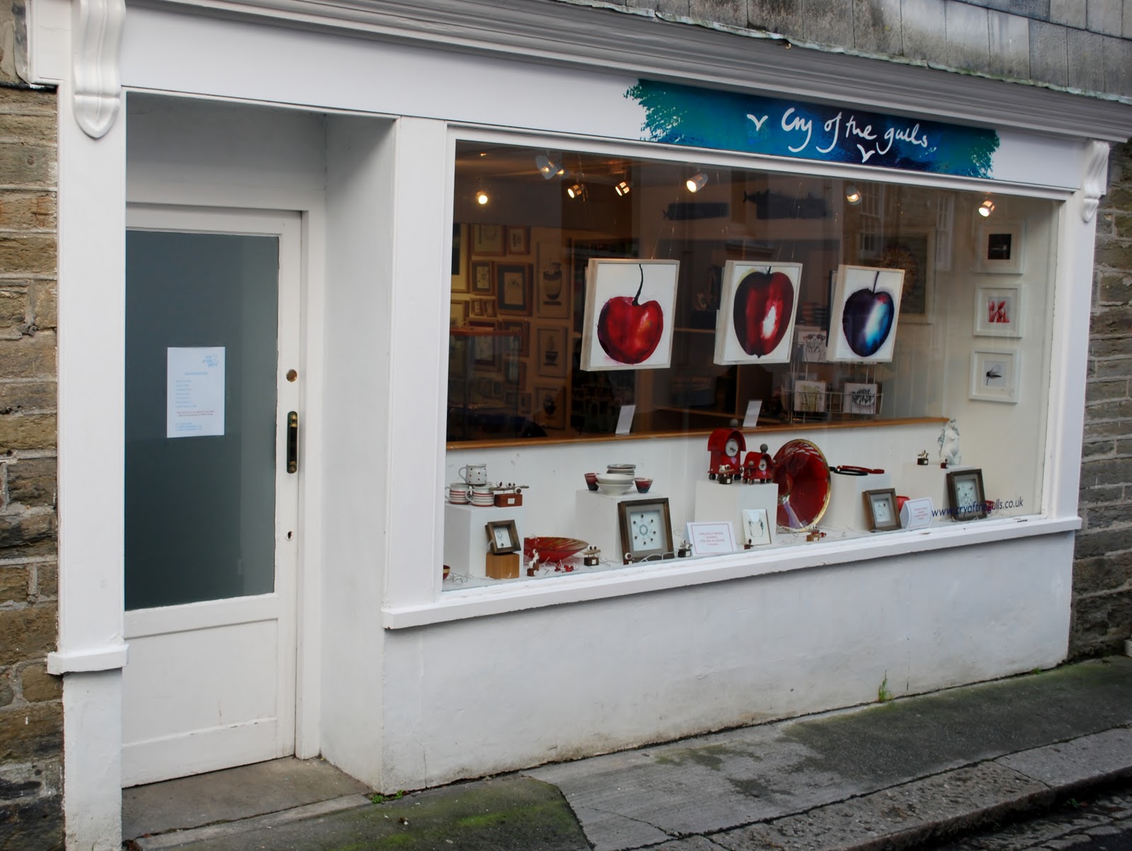
This is the first little gallery that I happened upon. From the outside it looks fairly like a tourist based art shop, but when you enter you realise its actually full of some really lovely things. Its next to the Fowey Fudge shop (which was sadly shut for winter) showing that it's in a tourist area. Interesting to note that they were still open for business, even though some of the shops around them had closed their doors to the cold, and to the locals. This was a place that isn't looking just for tourist money, its there for passing trade, and for the locals all year round.


 Its owned by an artist (Max Harrower), and at the time of my visit his sister was running the gallery come store. It's a relatively small space, but they have filled it pretty full of an array of local artists, and some Fowey based nick-knacks. The Lady working there was polite, and helpful and very welcoming, she was pleased to have my small piece of opinion, and for it to be posted online. She expressed her wish for all the artists that I show on this blog post, to be correctly described as to what work was done by which artist. She showed that she was interested in artists as people, not just as a commodity that could be exploited, unlike other galleries that I discovered this day, but more on them later. 


One of the pieces of work that stands in my mind from 'Toe In The Water' is Linda Evans' piece 'Mevagissey mixed media collage' which is from a collection of her work, they are decorative pieces, made of bits and pieces. Made to resemble local places, it keeps the interest in the quaintness of the place, without exploiting it. It's the sort of work you can only get hold of, if you happen to be in the right place at the right time. 
Linda Evans - 'Mevagissy Mixed Media Collage' (£65)
Linda Evans - 'FY6/FY7' (£65)


'Fused Glass Art' by Debbie Lord was also following this localised theme, with her beach scenes and little sea side houses made delicately and stylishly out of coloured glass. These really aren't things you can buy from a dealer in the middle of London, Its craft made by local people, of their local environment, sold in the same locality. That's what makes it special and worth a trip to either just look, get some inspiration for your own work, to buy someone close to you a special gift, or to treat yourself to a keepsake of your trip. It's about the trip, about the little holiday and the specialness of the place you are visiting. 
Debbie Lord - 'Moored by The Habour Wall' (£190)

Debbie Lord - 'Fused Glass Art' (Various)


Saying this, I did find a driftwood seagull, so it has fully conformed to all my coastal art assumptions. 
Driftwood items - Various Artists

John and Patricia Christian - 'Sea Shore'


Patricia Christian - Various Glasswork

Max Harrower - Canvas Boat Print (£85)


Review has been removed due from request from owner.


Review has been removed due from request from owner.


I learnt a few things from my little research trip to Fowey, That art can be local and lovely, it can be exploited for money, and some people care more about money; than they care about helping artists. A trip to Fowey is well worth the visit, I will be revisiting in the spring, when more places are open to the bustling tourist trade. 


Thursday, 19 January 2012

Assignment 6 (part) - New Website

Yesterday, I sat down and realised, That I just needed a professional looking website, That I could keep up to date. I thought about making a Lisa Birch Photography/Artwork facebook fan page, But decided it would then show, how un popular I currently am, So this is something I will create when I have more of a fan base. 

For now, I made a website with Yola.com, which is helping British Businesses get online for free, so I claimed my free domain name, and got started with their easy to use website builder.

My intention for this site is to keep all my projects connected in this one place, rather than being spread out everywhere. I also hope to display my new illustration work, and hope for some feedback.
So please visit www.lisabirchart.co.uk

Assignment 6 (part) - Visit to Mid- Cornwall Galleries


I thought I'd start my gallery tour, with the one closest to me, Which turned out to be a generally nice place to visit. It doesn't look like much from the outside, set in a old school house, just off a busy (as busy Cornwall can be in winter) road in St Blazey Gate, (near St Austell). It had plenty of parking, and two cars in the car park when I arrived, One belonging to the only member of staff, and the other; some gentleman who had popped in to buy a calendar to brighten up his home office.


The woman working there was polite, slightly chatty, and I had called earlier and spoken to her about taking a few photographs, and she was okay with this. (picking up on the European way of thinking maybe, photos allowed but no flash?) I wondered around first of all, looking at all the lovely things they had. and then did a second route around and photographed either things I liked, or things that stood out, and the things I didn't think fitted in. The woman explained to me that some of the work was very local, which I saw by the paintings of places such as St Ives, but she assured me that they had work from Europe and America. 


What was interesting to me to note, was that there was nothing purely on display, everything was purchasable, and for sale, with its little card dictating how much its apparent worth is. Some things were priced from £1.50 each for adorable earthenware buttons, by Mary Goldburg. Then I noticed that some pieces were a little over expensive for what they actually were, such as Rosa Sepple's works, 'Dancing Partners' Mixed Media on Paper, for £2750. Which was, in my opinion, some creepy badly drawn people, in situations that made the viewer feel slightly uncomfortable, with a whole lot of glitter. I don't know what it is about using glitter in something that's meant to be fine art, it just reminds me of my own GCSE art piece that I pretty much gave up on painting, and thought, sod it, glitter will fool people into thinking that's its lovely. (in fact that GCSE art piece sold pretty well, probably for the sheer fact that people like glitter) I just feel that Rosa Sepple's work is imaginative, but its lacking taste. It seems like she is trying to be provocative, but her figures are ugly and verging on the grotesque. 
Mary Goldburg - Earthenware Buttons (£1.50 each)

Rosa Sepple - 'Dancing Partners' (£2750)

Rosa Sepple - 'Tonight You Belong To Me' (£1400)


Onto something positive now, I found some very lovely small pieces in this gallery, such as Catherine Hoskin's pieces with little birds. One piece 'And So I Saw Perfection' (mixed media on board) for a modest £35 each, is just sheer loveliness, It isn't over fussy, and is something that I would aspire to create. She has show her creativity and expressed a good sense of taste and judgement. These images wouldn't look out of place as greetings cards, but as little framed pieces of inspiration they are adorable. Each piece has its own little phrase like ' Shall I compare thee to a summers day?'. Its inter-textuality appeals to me, in its little postmodern decorate way.

Catherine Hoskin -(front) 'And So I Saw Perfection' (£35) (behind) 'The Life of Birds' (£35)

Catherine Hoskin - 'Get Birds to the table in the garden' (£35)

Catherine Hoskin - Ye Little Birds (£35)


This little gallery is well worth a visit, if you are passing, or looking for something to do. It might be nice place to stop at if you're visiting the Eden Project, as its fairly close. But don't get caught out by its opening times, 11am-4pm in January. 10am - 5pm all other months, I'll include a few of the photos I took, but I have been told its 'stock' changes every 6-8 weeks, so it's worth popping in every now and again. It's a good place to go if you're looking for something affordable to decorate your home or office, or a gift, but it's not particularly risk taking. I did find a few too many sea-side themed pieces, some that were brilliant, and some that just felt like they just had nothing else to create.

Steve Parkinson - 'Tri Layered Box' (£275)

Gallery View of Beverly Young's canvas's (£140 each)

Gallery View of Simon Pooley - 'Windborne' (left) (£2750)

Jewellery Selection Anne Farag and Jane Llewelyn Jones (Priced £35- £215)

Tracy Rees Selection (£650 each)

Amanda Hoskin - 'Flowers at St Ives' (£3500)

Virgina Dowe - Dogs (£295 each)

Bob Crooks - Various Glassware (£23- £105)


Sunday, 15 January 2012

Assignment 6 (part) - Galleries

Local Galleries

I've decided to take a visit to all my local art galleries, since moving to the area, (mid Cornwall) only a few months ago I have not had a chance to go around and see what is happening with this local art scene. I hope it's not all summer tourist based, or I will become sick of looking at seascapes and non imaginative ways of portraying lighthouses.

In the summer I visited the Tate in St Ives, which on all accounts was a good experience, but something I would never willingly do in the middle of summer, ever again. The gallery itself was not packed, but its lack of car parking and beach side appeal of its location, meant the streets were seemingly hell. I have never seen so many tourists so willing to sun themselves on a relatively small beach, in a small town. I will probably never understand the mindset of tourists. Inside the Gallery, (once we had parked over double yellow lines up some private housing street, like everyone else had done) I found some fairly interesting pieces of art, although the only work that stands out in my memory is the work of Martin Creed, which they funnily enough used as their cover image for all their advertising for the summer show.  'Half the air in a given space' which shows a room, half filled with white balloons. It was an interactive space and I did have great fun playing in it. It encouraged people to re think the forms of space, and how spaces can be transformed into surreal places, by the use of balloons. It was imaginative, but nothing else in the collection really stood out to me, whether it wasn't to my taste, or I just had the feeling I had already seen similar works before.


I also visited British Art Show 7 : In the Days of the Comet, which is a travelling show, and stopped for its first time in Plymouth, it was fragmented into different venues, quite a stretch apart, from Plymouth College of Art, (which had Martin Creed's work), University Of Plymouth, Plymouth City Museum, Plymouth Arts Centre, and Royal William Yard. I see going to an exhibition as an enjoyable activity, something that should be savoured and time spent, but with these all split up and literally all over the place, it was hard to view it all as one touring piece. I admit that it was good for all the venues to host their little bit, but It shouldn't become such a mission and a pilgrimage (as Grayson Perry might put it) to visit this art. No single piece of work or artist stuck in my mind in a positive way, I was disgusted by one object in particular 'Object - Our House' by Nathan Mellors, which was a severed head, vomiting into a bucket. I did not see its value as an art piece, or why it had the audacity and pretention to be put into a gallery space. It was set as a side piece for a similarly cringe worthy film 'Our House'. It was tacky for the sake of being tacky, bad taste, bad humour and I just did not judge there to be any aesthetic taste or judgement used by this artist. 

Right, now reading this back to myself, Im going to go on a quest to find some Local art that I like and see artistic value in. Im going to visit all the nearest galleries to my house, and a few a bit futher a field. Using google to plot out my stopping points and best plan my routes. Here are a few places I will be visiting in the near future:

St. Blazey Gate, Par, Cornwall PL24 2EG
01726 812131 ‎ · midcornwallgalleries.co.uk

53 Fore Street, Par, PL24 2NH
01726 817317 ‎ · rittergallery.co.uk

38 Fore Street, Fowey PL23 1AQ
01726 833828 ‎ · foweyrivergallery.co.uk

10 Lostwithiel Street, Fowey, PL23 1BD
01726 832582 ‎ · toeinthewatergallery.co.uk

2 Webb Street, Fowey PL23 1AP
01726 833838 ‎ · cryofthegulls.co.uk

Quay Road, Saint Austell, PL25 3NJ
01726 67886

The Old Workshop, Charlestown Road, St. Austell PL25 3NJ
01726 70458 ‎ · charlestowntrading.com

28 Fore Street, Lostwithiel, PL22 0BL
01208 873990


21 Fore Street, Fowey, PL23 1AH
01726 832005

71 Charlestown Road, Saint Austell PL25 3NL
01726 65900 ‎ · atishoodesigns.co.uk

13 Lemon Street, Truro TR1 2LS
01872 275757 ‎ · lemonstreetgallery.co.uk

Lemon Street Market, Lemon Street, Cornwall, Truro TR1 2QD
01872 275578 ‎ · landergallery.co.uk

24 New Bridge Street, Truro TR1 2AA
01872 273747 ‎ · driftwoodgallery.co.uk


I decided I'd better visit quite a few, to make more of a chance of finding something I like, and that inspires me. I'm aware that these are mainly little individually run and owned galleries, and I won't be viewing anything as extreme as the next Damien Hirst or discover something as obscure as the next Francis Bacon. I'm just a bit fed up with all the Tate branded artists, so this is my mission, to find assessable art on my doorstep. It shouldn't be too difficult considering I'm living in somewhere that claims  to be cultural and artistic, Just hope I don't get too sick of looking at too many seagulls made of driftwood.


Monday, 5 December 2011

Assignment 6 (part) - Research and Mumblings on Jeff Koons

I have decided to focus the first part of my personal research on a few select artists, that are in a style that I'm personally striving to be in the same concept zone as. They might be a bit obscure with the way that I have chosen certain artists, but in my personal opinion, they all have made a major contribution to modern art, and the ideas of popular stylised art. They all feature, In different ways a confident cute aesthetic that I'm searching to understand more about, you could say that have that je ne sais quoi about them. Some of the artists that I'm going to look into and research in the next few weeks, as a starting point to by project, are: Grayson Perry, Jake and Dinos Chapman (for an anti view), Walt Disney, Hayao Miyazaki (founder of Studio Ghibli), Ikuko Shimizu (founder of Hello Kitty) and not forgetting Jeff Koons.

Jeff Koons is a fairly well known American artist, best known for his high shine metal sculptures, or his range of inflatable flowers. One collection that I'd like to focus on is his 'Celebration' series, where he features life milestones in oil paintings and sculptures. His work has an overall plasticised feel to it, everything is made of a high gloss plastic, or painted in a way to look like a high shine plastic, or metal object. His metal objects are extremely shiny and always includes the viewer in the piece, as you cannot avoid yourself in these mirror like pieces.

This reflectivity is no more incidental to the work than its linearity, since even the paintings mostly depict their subjects against mylar backgrounds, and though the resulting play of light gives the work the appearance of being constantly "on," its import is not purely visual. What does the viewer see as he circles one of the sculptures? It, certainly, but also himself in its surface. It is virtually impossible to see the artwork without seeing oneself. (Supervert, 1997)
Hanging Heart - Jeff Koons 1994-2008
That Koons has found a way is made plain by the unexpectedness of the terms (trust, sincerity, archetypality, objectivity) in which he speaks of his new work, Celebration.(Supervert,1997)
One of the major pieces of work is the 'Hanging Heart' which is probably one of the most recognised as being Jeff Koons, It's a very large very shiny metal heart, with all the connotations that go along with the heart as a symbol, love, sex, desire, all wrapped up in a high glossed coloured mirror finish, it really is an item of fetish value. Or in contrast, is it an item of cute value, as hearts are considered to be sweet, and cute, but then you must look back to the meanings of sexuality expressed in the shape.

Tobias Meyer, Sotheby’s Worldwide Head of Contemporary Art, said: "Hanging Heart is a stainless steel monument from a body of work so rare, so surreal and so beautiful that one almost ceases to believe it exists. Executing this work required extraordinary precision, finesse and lavish attention to achieve such perfection of the highest order. Koons is an artist who doesn’t allow compromise, and Hanging Heart is all about making an impossibility possible." Alex Rotter, Senior Vice President and Senior Specialist of Contemporary Art, continued: "This is a simply unforgettable work. Hanging Heart is both powerful and romantic – the quintessential reflection of sexuality. It is highly desirable and the perfect match for this icon-driven market." (Art Knowledge News, 2007)

I quite like the idea of including an element of shine to my work, but I am failing to find a connection with how I could include this in a new way, and not in some cringe worthy pastiche. So, I will move onto looking at other elements of his work, such as the bright colours. Maybe this is where the magic hides, with his use of colour, is there a link between colour choices and a childlike essence, I think so. The bright colours that he chooses are reminiscent of childhood toys, which also feature in a new way in his work. Toys and childlike features may be able to play a key role within my project of identifying exactly what 'cute' is, is cute a sense of childhood items, past memories, before we were aware of perversion?

Koons chose to cast many of the Celebration sculptures in polyethylene for precisely this effect. This plastic, common in toys, is the material with which children learn how to become adults: one’s first hammer and gun are always polyethylene. However, in Koons’ sculptures it points not forward but backward: invoking cognition less than recognition, it turns the focus away from the artist (why did he do that?) and toward the viewer (I remember that!). The very transition from a question to an assertion already indicates an increase in certainty. (Supervert, 1997)

Position 3 - Jeff Koons 1993
This confirms my point about Koons wanting to include the audience in the piece, whether it be about remembering something from childhood, or actually being visible in the mirrors, or both. Koons is interesting as an artist as his work has progressed extensively over the years, his earlier work is fairly pornographic, such as the 'made in heaven' collection, He is trying to dig into a new aesthetic, while maintaining his own personal style, but he has become increasingly popular the less sexual at first glance his work appears to be. Rather than the blatant sexuality and fetishism that is shown in his made in heaven collection, he has opted for a more low key style of fetishism, consumer fetishism. By that, I mean the high gloss commercial art world, with its desirability being placed on kitsch items, which can now be picked up on from the trend of Warholesque commerciality, with the same link to Warhol as low culture items being made into high art.

A repudiation of this asceticism was latent in Koons long before the pornographic works of Made in Heaven. Certain early works such as BUNNY were able to turn the readymade on its head simply by no longer treating it puritanically, like a chess move. Instead, they approached it by means of affect and visceral response. BUNNY was pretty, happy, glossy, funny, even beautiful. Might not the simple certainty of a sensory experience revitalize the aesthetic compact? When an artwork inspires a sense of beauty, it is as difficult to doubt the reality of that affect as of a feeling of pain. (Supervert, 1997)
Bunny - Jeff Koons 2007


There is no real doubt in my mind that Jeff Koons work isn't gorgeous, It definitely has that certain je ne sais quoi that I've been looking for, and now I've been able to deconstruct very briefly some of his ideas I should be able to take inspiration from his skill, both with the conceptual elements, and with the perfect perfectionist finishes. He is indubitably a master of capturing this 'cute' aesthetic, but not in the way of manga faces drawn onto simplistic cartoons, he does however capture the 'cute' aesthetic in the form of innocence, with a possibility for perversion.


References:
artknowledgenews. 2007. Sotheby's NY to offer Jeff Koons' " Hanging Heart ". [ONLINE] Available at: http://www.artknowledgenews.com/Jeff_Koons_Hanging_Heart.html. [Accessed 05 December 11].

Covent Garden London. 2010. Jeff Koons Rabbit Bounces In. [ONLINE] Available at: http://www.coventgardenlondonuk.com/events-entertainment-culture/articles/jeff-koons-rabbit-exhibits-in-covent-garden. [Accessed 05 December 11].

Jeff Koons. 2011. Jeff Koons. [ONLINE] Available at: http://www.jeffkoons.com/site/index.html. [Accessed 05 December 11].

Supervert. 1997. Jeff Koons: Frankenstein in Paradise. [ONLINE] Available at: http://supervert.com/essays/art/jeff_koons. [Accessed 05 December 11].

Tuesday, 22 November 2011

Assignment 5b - Developing my Audience

My Current Network Connections:

• Fellow Students at Plymouth College of Art
• Personal connections
• Peer network of fellow photographers
• Previous clients
• Modelling Connections

Networks I need to build:

• Relationships with Curators
• Connect with Outside Art Businesses
• Improve relationship with local and national galleries
• Expand my personal connections
• Branch out with new business connections
• Expand my Client base.
• Develop more of a relationship with venues, such as for weddings and events.

I will be able to make these new connections by being proactive and attending more lectures outside of university, by visiting more galleries and generally by getting to know more people in a professional sense. I will also maintain my relationships with previous clients in the hope that they will require me again, or recommend me to a friend.

In five years time, I will be almost 27, by this time I really desire to be in a role within the art community that is secure. I would like to either work for an art/creative based business or become an art teacher/lecturer. I would like to move to a bigger city, but would ideally like to avoid working in London. Overall I will be looking for a way that I can live comfortably while still expressing myself through creative practices.


Network - Updated
Past Client base - Prefer not to disclose contact details.
Rise art - www.riseart.com
Collaborators-
          Joan Haywood - www.emmajoanphotography.co.uk
          Steve Champion - http://www.championtattoos.com
                                - tel 01460 68263
                                - Champion tattoos, Stringfellow Gallery, Holyrood St, Chard,Somerset, TA20 2AH
                              - Social Networking and Online connections (553 people)
Arts Matrix -  http://artsmatrix.plymouthart.ac.uk
Tribe Magazine - http://www.tribemagazine.org/index.html
Local Art Galleries-
Mid Cornwall Galleries
St. Blazey Gate, Par, Cornwall PL24 2EG
01726 812131 ‎ · midcornwallgalleries.co.uk

Fowey River Gallery
38 Fore Street, Fowey PL23 1AQ
01726 833828 ‎ · foweyrivergallery.co.uk

Toe In The Water
10 Lostwithiel Street, Fowey, PL23 1BD
01726 832582 ‎ · toeinthewatergallery.co.uk

Cry Of The Gulls
2 Webb Street, Fowey PL23 1AP
01726 833838 ‎ · cryofthegulls.co.uk


Monday, 21 November 2011

Assignment 5a - Project Proposal

I would like to propose a research project based on the idea of studying what is ‘cuteness’ in terms of an aesthetic taste/style. I want to examine the trending of “cute (kawaii)” based art in western popular culture. I hope to explore why there is this increase in popularity and if this has any affect on sales of artworks. I’d like to discover whether the west has embraced a new sense of aesthetic by taking inspiration from the “kawaii” movement, and how western traditions and ideologies affected the east, with relation to art movements and cultural styling.

Have you ever found yourself smiling when presented with a cute character in a website or video game? Maybe you have noticed that a virtual character displays a personality of youth or excitement, or a friendly demeanour. Designers often purposefully enhance such characteristics to impart positive feelings and to help establish a micro-relationship between the user and the character. For instance, in Japanese culture, the “cute” aesthetic known as “kawaii” is used by many organizations for many purposes, including mascots for the police and warning signs for dangerous areas as well as for video game characters. (Cheok, 2008)

I feel that this research is needed because it is clearly a current trend. I believe that research has not yet fully bridged this gap of knowledge as to why the movement has become so popular and the affects of it on the wider society. I also think it’s important to know the consequences of introducing foreign aesthetics into a culture. The affects it may have might stem from the issue of globalization and the suggestion the world is becoming more like a global village, where thoughts and arts are expressed openly and unmediated mainly using technical elements such as the internet. I feel its important that we can understand the cultural significances to maintain our own cultural heritage, and develop an open understanding of international blended art styles and cultures. I feel it is necessary to look more closely at the affect we have on each other and our understanding of certain terms, such as “cute”. Has western aesthetics been influences by “kawaii” culture, is an issue I feel is a big concern to traditionalists which is why I would like to branch my project in this direction.

The process of cultural globalisation does not always imply cultural homogenisation. Rather, it can be seen as a process of cultural ‘glocalisation’ and hybridisation where cultures continuously interact with and interpret each other to engender a hybrid cultural form. (Monden, 2009)

I feel I have a strong external rational to continue with this research led project. I feel it is a needed study and will benefit the academic society. I will continue to research into this subject matter and expand my knowledge on the subject.

References

Cheok, A, 2008. Designing cute interactive media. innovation magazine, [Online]. 8, 2. Available at: http://www.innovationmagazine.com/volumes/v8n3/preserved-docs/08_09.pdf [Accessed 21 November 2011].

Monden, M, 2009. Transcultural Flow of Demure Aesthetics: Examining Cultural Globalisation through Gothic & Lolita Fashion. [Online]. 2, 21. Available at: http://www.jpf.org.au/newvoices/2/chapter2.pdf [Accessed 21 November 2011]. 

---------------------------------------------------------------------------------------------------------


Contextual Survey and Review

Cheok, A, 2008. Designing cute interactive media. innovation magazine, [Online]. 8, 2. Available at: http://www.innovationmagazine.com/volumes/v8n3/preserved-docs/08_09.pdf [Accessed 21 November 2011].

With this source it helps to form a basic understanding of what ‘cuteness’ might be and offers an insight into what the Japanese aesthetic of Kawaii. They also look into how the principles of cuteness and Kawaii can be applied in a practical sense, to help sell products. Within this source there is also information from primary research that they have undertaken, examining what is perceived as cute, such as ratio of head size to body, which colour hues are considered to be the cutest, and what type of shapes conform to the cute ideal. This has helped me to form a basic understanding on the concepts of cuteness and how it can be applied to real life situations. I feel however I need to research deeper to find a source that offers me more of an explanation of why cuteness is popular, and how I can apply this.

Kwon, M, 2009. Commodifying Identity: Takashi Murakami 1989-2008. Modern art Asia, [Online]. 1, 1-23. Available at: http://modernartasia.com/Takashi%20Murakami.pdf [Accessed 21 November 2011].

This source I did not use within my text, but feel it explores an element of Asian culture that I wished to learn more about in order to make my writing more informed. It examines the identity of an apparently well-known Asian artist Murakami and how his work relates to both eastern and western art principles. It looks at how artists can branch between the cultures and how mega brands, such as Hello Kitty are able to pass through cultural barriers and become internationally popular. I feel that this source is going in the right direction but it lacks information on the idea of the cute aesthetic in any detail.

Monden, M, 2009. Transcultural Flow of Demure Aesthetics: Examining Cultural Globalisation through Gothic & Lolita Fashion. [Online]. 2, 21. Available at: http://www.jpf.org.au/newvoices/2/chapter2.pdf [Accessed 21 November 2011].

This source looks at the issues such as globalisation and the affects on all cultures. It suggests a view point that I had not considered that each society is mutually implicative of each other. I feel that it is very important for me to continue reading sources like this that examine the cultural implications of my proposed project. As with this information it will help me to make a well informed project.  I feel I need to be aware of transcultural works, but need to find a more specific example that is not looking at fashion aspects. I also had the theory of the male gaze and sexualisation forced upon me while reading this source, suggesting that cuteness and its origins are stemmed from sexuality, such as a child like existence, and with that being perverted.

Mapping

Plymouth Rowing Club - Charity Calendar

I was asked to shoot for Plymouth University Rowing Club, for images for their charity fund-raising calendar for Water Aid. Here are a few sneek peaks, but you'll have to all go out and buy the calendar when its ready.

The group were great, and I think we succeeded in creating the tongue-in-cheek slightly humorous images that they wanted. They wanted each month to have a theme, such as green for St Patrick's day in March, Drinking for freshers week in September etc. I would like to thank my lovely assistant Joan Haywood, for helping me to deal with all these naked rowers!


Sunday, 13 November 2011

Assignment 4 - Mind Map

Assignment 3 - What is the Harvard method of referencing? How is it different from other referencing methods?

The Harvard method of referencing is the preferred method now adopted by academics, it is sometimes referred to as parenthetical referencing. This just means that the referenced item is included within the text, so it can be seen by the reader in its shorthand form within the text, and not included as a numbered/lettered reference point to later be looked up in a footnote. This footnote style was previously popular but the Harvard style seems to have more regard in contemporary referencing.

Harvard is an example of referencing; its format is within the text, with the authors name and date in brackets. Depending on the source that is being cited then different elements will be included in the reference list/bibliography, for example with an internet website source, there will be ‘date accessed’ included. When citing material found on a website, you should identify the authorship of the website. This may be a corporate author, an organisation or a company; a guide to this can be found by looking at the URL or web address. To find the date of publication, reference to this might be found at the bottom of a web page relating to copyright, or from a date headline. This can then be referenced like, (Guardian, 2011) with in the text, after the quote or reference. Then a longer note will be made in the reference list/bibliography that explains the exacts in a predetermined order. (This can be found here)

There are some positive points about Harvard referencing, Firstly, It allows the reader to recognise works from an author while reading the text, and as they are short additions to the main body of text, it might be possible for the reader to make links between authors that have been quoted multiple times during the same piece of text. This will allow the reader to make a connection that they may not have realised if the footnote method had been used.  Secondly, with the name, date system it can allow readers to decide for themselves if the work is new enough to be considered useful to them, for example if they are only looking for sources dated post 2000. Another positive point about using the Harvard system would be to the academic creating the text, If the order of quotes is reordered, then the end note section, where the footnote referencing number points are, will not need to be re-ordered. This is because the bibliography that is included with the Harvard style is alphabetically ordered by author’s surname.

Unfortunately as with any system, there are some disadvantages, the main downside is that the references take up space in the main body of the text, they can be distracting to the reader. In many cases the date is not important to the work, so it just takes up space. Also some referencing points are missing, such as not knowing the date. In such cases the reference is (name, n.d) Which I’m assuming stands for no date. 


or for a quick cheat click here.
- Lisa Birch